Sunday 30 December 2012

Extra work into the Human Characters... (POINT 3)

At Christmas I received 'Spaceship EE' by Aya Takano.
I admire her varied use of media while making sure characters do not change drastically.

Spaceship EE cover slip. (original medium:oil paint)

Although the majority of the book is done in black and white, the first few pages are done in bright watercolour. This is to exaggerate the spaceship dreamscape that the main character is first seen experiencing.
The first double page in the book.
(original medium:watercolour/gouache)

I love Takano's style of drawing throughout the comic. For me, it seems like it quite a straightforward way of documenting the narrative, as if she is experiencing the situations firsthand.
Another thing I admire too is how the characters still show emotion through movement or slight changes in the face, yet still manage to keep fairly blank and neutral expressions. Some characters have a set expression, usually to show their status in the story and if they are a friend or foe.
Example of a double page.

What I find really interesting however is the rather extensive guide and glossary that Takano gives at the end of the book. Here characters, creatures and significant objects are identified. There are even explanations for different scene and events throughout the story. Especially when talking about the space and dream-like creatures, this guide seems to turn into a fieldbook, with sketches and notes scrawled around.
The first page of the Character Guide.
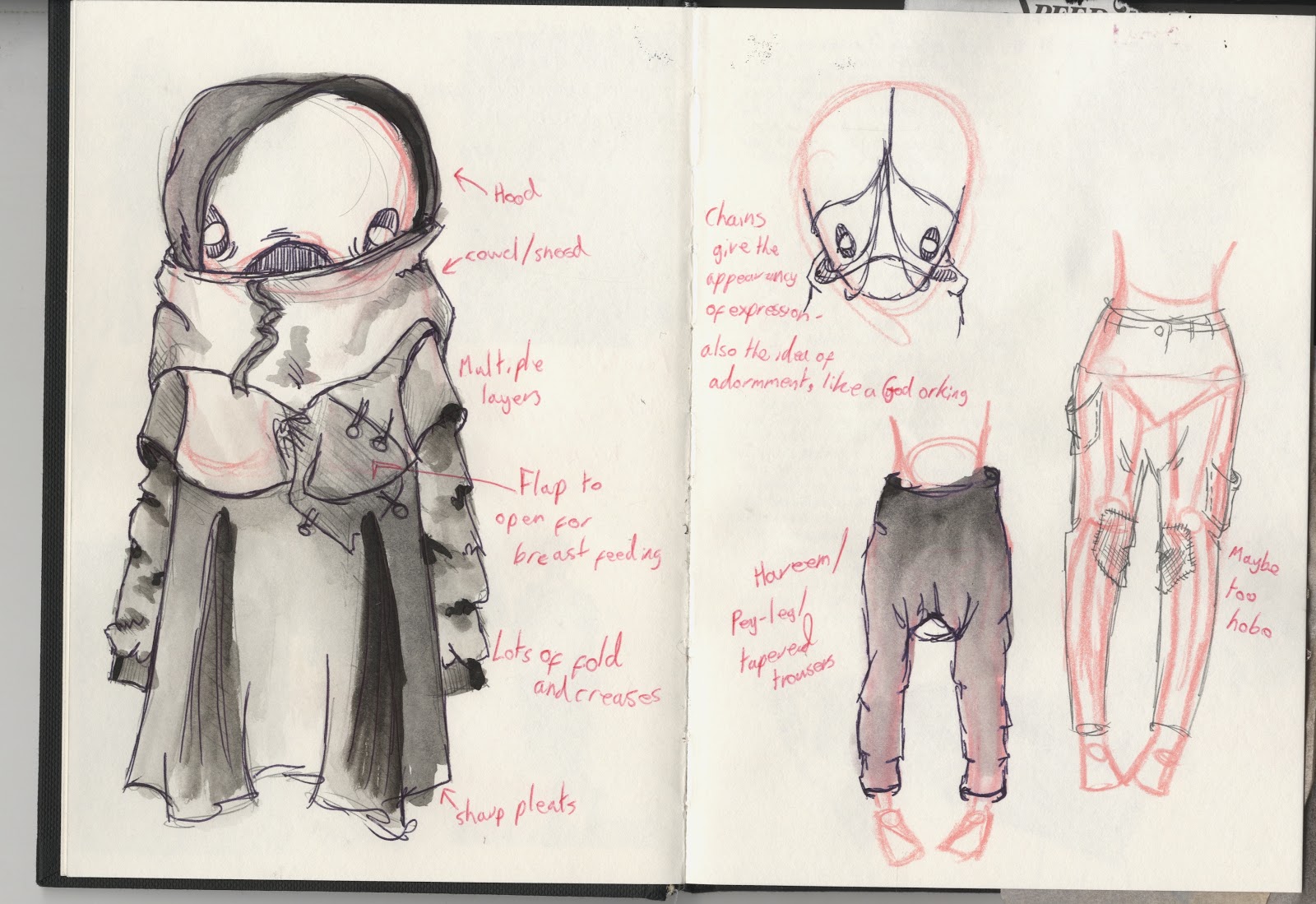
From my new influence, I gave myself a timed period in which to review my human character appearances.
A4 page of sketches.
After scanning this in, I then went onto quickly putting in basic colours for the human characters and the cheeky little Nikahrat too.

Photoshopped colour differences.
This was definitely a good decision as even though it is a very basic plan, I was able to see for the first time my initial desired character colour palettes against each other.
My brief evaluation on is positive. The dark reds/burgundies of the humans help the Nikahrat fade into 'the background' better.

My new Male and Female characters.
Here are my most recent (and hopefully) final human character designs.

From these I did similar experiments to what I practiced on Nikahrat, exploring texture and colour.
However, this time I tried a different method.


This is an extra layer for the colour/texture. By roughly using the character line work as a template, I painted in the patterns and colours. The gouache paint brought in its own soft texture. However, I am not sure if something a bit harsher is needed so the humans don't clash with the softness of Nikahrat.


EXPERIMENTS:

(1)
These are the three personal favourite experiments. (1) Shows how the line work fits over the colour. The colour doesn't lie true to the lines but I like the effect it gives. It makes it feel very handmade and even has a slight effect of hand-printing too. For (2) I used one of the 'burn' overlays. It doesn't alter the colour or entire image drastically. However, the colour sticks to the darker areas of line work. This works better on the female character because she has more texture detail. Example (3) is my favourite because the colours are so bold and striking against the line work. It really has a hand-painted feel to it. Even though it is technically hand painted, it doesn't look like two separate layers.
(2)
(3)


These are all screen shots of my photoshop to capture the overlay and layer information and the outcome of the combinations.


 REJECTED EXPERIMENTS:
Even though I have decided not proceed using these particular experiments, they still look really interesting and I can still use the same effects in different ways.

Inverted colours- Again, the female character benefits more from this effect because she has more line variations. The eyes look especially interesting too.
In this case, I would assume that these characters would be better set in a morbid, sombre setting or in a sci-fi theme.


Whitened lines- In this case the male character benefits more as he has more block colour. However, the stripes on the female's dress and  legs make very interesting patterns too.
 Inverted with red- This does look similar to the inverted example due to the white lines but here the red paint layer is still kept underneath. However, this overlay inverts any white or light areas, meaning the male's block colours don't show because it is a light wash. Here the eyes and the female's snood and legs take most of the benefit as the colour shows through the white line areas so well.
Extra Experiment-


This was a quick flat colour experiment to see how the possible different shades of red and burgundy would look against a flat colour background.
I went for this dark, murky teal-like colour because it set off the line work and highlighted shading. However, I'm not sure how well it would work against the colours in the Nikahrat palette.

Wednesday 19 December 2012

Nikahrat colour (POINT 2 & 3)...


Sketchbook page showing colour mood-board.
I first started to make a mood board of colours that I imagine suit the Nikahrat character the most.
I have chosen blue and purple hues to compliment her fragile and feminine nature.
As seen from the colour testers, I have been very strict with myself when criticising the colour mixing. This is because it is very important for me to get the right colour but also the right consistency of paint and texture.

So far I am using only gouache paint. This is because it is what I feel most comfortable using and, after all, this should still be showcasing my strengths and overall style of illustration work.

I had a few happy accidents in this process. The most significant was discovering how my water-brush created a much softer, translucent effect when it had got a range of different colours still on its bristles.
This was originally the piece of paper I was cleaning my brush on before I attempted to mix more colours.

My other 'accidents' were more intentional. After trying my water-brush, I wanted to test how a normal brush would react with the same paint but with different water consistencies.

For this I used Winsor & Newton Poster Colour Gouache in 'Ultramarine Blue' and a Winsor & Newton Watercolour Cotman 999 series brush (16mm).

Dry Brush
Relying on the moisture of the paint to carry the paint along. Effect achieved by sweeping the brush back and forth to spread the paint as much as I can.


 Damp brush
Very little water on the brush. Effect created by pulling the brush back and forth to add pressure. Each stroke pattern blends with the next smoothly but with some texture.

Wet brush
Brush is soaked under a tap and applied straight to paper with the paint. Single brush strokes which bleed into each other. Extra paint spots added to bleed into water by their own accord.

With these experiments I decided to use photoshop manipulation to play around with textures, colours and overlay.


Tuesday 18 December 2012

Colour Experiments (POINT 2)...

I need to think quite carefully when using colours for this project.
I need to make sure that characters and backgrounds do not clash and cancel out each other or, for least important components, stand out more than the page interest.

I need to take into consideration the colour wheel and how certain colours should be balanced against each other.
Colour wheels showing the spectrum, analogous, triadic and complimentary colours.

How complimentary colours should be placed to be optically balanced.
A nifty tip to remember is that any colour will go with grey as grey is optically neutral and will make any colour next to it stand out.

I managed to find a colour sample leaflet in the art shop that is supposed to be for an acrylic paint series.

Colour sampler in sketchbook.
I have stuck this in my sketchbook so it is easier for me to refer back to colours and see as to what colours appeal to me and could work in a mixing process.
The colours in the boxed red areas are the colours that appeal to me the most.

Thursday 13 December 2012

Developing the human characters... [IN PROGRESS]

Page from sketchbook.
Before starting to go into too much detail with the humans, I needed to give myself a checklist of what criteria my human characters need to fit. After my long-winded, loose ends challenge with Nikahrat, I need to cut out as many distracting avenues as possible. This is not only to save time, but I have now realised that because I feel so passionately about this project, story and characters, my ideas are very clear. Once I have an idea, it seems to pretty much fit into my final outcome vision with little alteration.
I can confidently say it is at this point I feel I can trust my instinct and it won't let me down!

Human characters' criteria:

  1. Take into account their height. They stand around the height of Nikahrat's shins.
  2. Facial expressions. They need to look ignorant/arrogant and miserable, like they think they have the whole world on their shoulders.
  3. Body shape and clothing. How to exaggerate certain features and how can the clothes affect the appearance of the body shape.
  4. (Linked to body and clothes) The style of line work needs to oppose Nikahrat's soft and fluid curves.
Female and Male characters.
Rough photoshop to show humans compared to the Nikahrat.

Next steps from here... (POINT 2)

  1. Focus on designing the humans
  2. Draw up more detailed studies of the Nikahrat baby and her tentacle egg
  3. Experiment and explore colour- decide upon the colour palettes for humans and the Nikahrat

NEW NIKAHRAT! (POINT 3)

This is the the final sketch for my Nikahrat character!

This sketch also depicts the height differences between the Nikahrat, humans and the newborn Nikahrat.
This is very important as I have made some rather distinctive changes to Nikahrat that affect the other characters.

The main force behind this was from the word "poetic". The whole idea of an illustration is to convey words and meaning. Because all of my book's illustrations accompany my poem, details within the design of characters have to be dealt with carefully to enhance the mood of the poem, make connotations more sympathetic and reflect my original want to create this piece in a more delicate way for the audience to interpret.

1. HEIGHT:
The exaggerated height differences between the sets of characters is meant to be puzzling.
Usually, if someone tall is moving about in a crowd, it it easy to notice them. However, Nikahrat seems to be so tall that the humans she walks among do not seem to stretch themselves to find her. The thought of her size, and possibly presence, scares them as do many uncommon or complicated subjects do.
The baby Nikahrat is below human height, probably about the average height of a human child. This connotes the idea that adults ignore children to an extent. In the human world where the Nikahrat resides, there are no human children. This is because everyone is expected to grow up and learn as soon as they can. Humans need to compete with each other by becoming smarter, showing more maturity, boasting about life experiences. 
The freedom and ideologies of childhood are lost both in the morals of humans and the Nikahrat's role because as soon as the Nikahrat baby is born, it has to start coping with troubles and enduring pain that no normal child does or should experience.

2. FEATHER SHAWL:
Although I carried out a lot of thought into clothing Nikahrat, I have decided not to go into so much intricacy and detail. I think the character as it is now conveys a lot stronger emotions, mystery and shock than some of my weaker experiments would.
Because the Nikahrat story does follow along the lines of a possible piece of folklore, I used a piece of personal 'folklore' to explain the feather shawl.
My mother, at times, can be rather superstitious. One of her most prominent superstitions is associated to seeing white feathers. She says that if you find white feathers indoors, or in odd and hard to explain places, it means that someone who has passed away is thinking of you. This is a very peaceful, relieving and respectful belief and I have tried to delicately honour this. The idea is that as the Nikahrat moves along, feathers fall and drop as it walks, showing that she cares even though humans cannot see her.
However, it appears to be part of the Nikahrat's anatomy, showing that this love and care is a part of her purpose, not just a face she puts up like most humans do. This is why the baby Nikahrat only has a few feathers because the more turmoil and sadness she witnesses, the more she learns and the more she wants to help and selflessly care.

3. 'RIBCAGE' CHEST MOTIF:
This idea formed in the very first sketch of Nikahrat. At that time, it meant nothing apart from showing a nod to being inspired by Mexican 'Dia de los Muertos' art. I have enjoyed 'Day of the Dead' art for many years as it balances handmade crafts and joy with the sombre realisations of death and mortality.
Jose Guadalupe Posada's print of 'La Calavera Catrina' (1910)
This comes through Nikahrat too. It is clear to see there is death scarring her life but she makes no deal of it and, instead, wears it but a mere symbol of her love and duties to help humans.

It wasn't until I experimented with screen print that I realised how interesting this idea could be.
'Rib' detail on screen printed Nikahrats.
Although this pattern is too ornate, the white spaces gave me the idea that perhaps they are not just decoration on her skin, but holes in her chest! With the screen print, the colours didn't really work as the Nikahrat's simple organ network was supposed to show through and, unfortunately, the heart space looks like a paint blob.
However, after redrawing from the final sketch, I was able to convey the same thing in a much clearer way.
Done with watered ink and gouache.
Here, it is much easier to see the contrast between the Nikahrat's (to be confirmed) pale exterior and her dark, hollow interior. No vital organs appear visible, raising the question of how it is possible for her to survive. The heart (which the only organ in her body except her womb) seems to be so exposed through the ribs and it can even be seen through her thin, fragile skin too.
I want to experiment with this further, however, to really emphasise the hollowness of her body and the glow of her heart.

4. HEART:
Because the Nikahrat is a very selfless and loving character, she leaves her heart exposed for all to see. The problem with this, however, is that it is easier for people to hurt it or even steal it.
Taking this idea, I altered the Nikahrat's heart so that it still represented a strong powerful emotion, yet gave more mystery to her existence.

Page from sketchbook.
I chose to go with an object similar to a crystal or cut precious stone. This is supposed to signify many things, especially revolving around humans desire for such objects. Humans rarely value the process of how these crystals and stones are naturally made: instead, they only care for their currency value and what that brings to one's image and status.
However, they seem to respected more within families. Jewellery or stones can be held in families as heirlooms, the prize for any family member to be entrusted with. Though most heirlooms are treated with respect, they can cause distress and upsets in greedy family circles. This is the case with the Nikahrat as the baby adds to the disrespect and spitefulness as it is being born by pulling the Nikahrat's heart with it, killing Nikahrat.


With all these new connotations added and explained, I am really happy with my final Nikahrat character and I am more confident in continuing smoothly with the progress of my final major project.


Tuesday 11 December 2012

Reviewing Nikahrat design advancements (part 2) [ POINT 3 ]...

After the interesting yet failed experiment with the body shape and new clothing ideas, I found the very first drawing I did of the Nikahrat...

At this point, being as I really haven't mentioned it much yet, it might be a good idea to explain how this creation first came into existence...

My personal origin of the Nikahrat

At a particular time in my the summer between Second and Third Year, I was not very happy.
I had a lot of unanswered questions, doubtful outcomes and unnecessarily built-up anger.
The problem was that I did not want to show any of this and I most certainly did not want anyone intruding.

One evening, after a day of several unhappy conversations and unsuccessful drawing , I 'zoned out' to say the least and just drew what I was thinking of.

What came out was this poor creature.

In certain terms, this is a depiction of how I was feeling; awkward, alien-like, with my innards starting to wear away at me and show through and a strange, unsure feeling that something deep down was not right.

What if this creature was me?
Or better still....what if this creature could act as me so I could feel normal and happy?

From there I wrote the poem of The Nikahrat, a description of what I wished existed.
And everything pieced together and made sense.
In itself, actually creating the Nikahrat and the poem relieved my personal stress and worry, just as the Nikahrat is supposed to do...

Since this time, I have had many changes in my life and I am feeling a lot better. This, however, is why I think the Nikahrat has changed.
Because I am happier now, the Nikahrat doesn't need to absorb so many horrible or troubling thoughts.

So using the original sketch as the base of my design review, instead of the Nikahrat I used in my dummy book, will help anchor me more to the key emotions.

However, this proved to be difficult because I had been drawing the new Nikahrat for so long I was still subconsiously using it as a template.


This was when I decided to stop looking at my most recent studies and reverted only to my first sketch for inspiration...

Wednesday 5 December 2012

Reviewing Nikahrat design advancements (part 1) [ POINT 3 ]....

Now that I have a better understanding of how my book should look when it is complete, I want to start reviewing certain aspects.
The first of these is Nikahrat herself.

One sad thing I noticed when comparing the first sketches to the depictions in my dummy book was that she had become too simple.
The body had dramatically changed and so had the face. Therefore, I want to try and revert back to some of my original ideas, while adding in some new ones too.

First page in design sketchbook.
Because the Nikahrat is supposed to blend into the background to show how humans don't acknowledge her existance, I began to think of some contrasting applications that could be used to emphasise her presence.
  • The apparent softness of her skin / Rough textures around her
  • Currently naked state / Heaps of material in the form of clothing
  • Soft curves and lines / Angular, rough, uneven cuts in the clothing
  • Light coloured skin / Dark or contrasting clothing
For the clothing inspiration, I took ideas from my own fashion preferences. The current revival of grunge, punk and gothic clothing has seen an advance in a style that I would call 'Post-Apocolypitc'.
The idea of this style is
  1. Black/dark coulours
  2. Angular/ irregular cuts, hems, folds and levels
  3. Layers
  4. Snoods,cowels, hoods
  5. Lots of material in certain layers
  6. Contrasting legs (legs tapered, made to appear thinner)


Quick initail designs.

Further found inspiration. Concentrating on decoration and headpieces.

While working on this, I had a change in heart over the body shape.
Taking mental references from old civilisations and Hitler's ideaology of women, I began to look at the shaps of Nikahrat's hips.
Wider hips in most old cultures were seen as being more desirable in women, as this was a sign of better child bearing and fertility.
This can link to Nikahrat's poor situation of having to carry such a large, hateful and difficult child. It also shows that she does have the air of fragile, stereotypical femininity about her with the big hips and small waist.
This lead me into looking at the clothes differently...

Page for looking at contrast between clothing and bare skin.

Body shape template (with 'baby bump' and pregnancy waistline). 

Skirt and chaps alternative.

Shorts alterenative.


I played around with how I could reveal skin. I didn't want to draw arms and necks too much because the shape of the clothes is supposed to distort the view of her anatomy underneath, almost to alien-like standards. I wanted to show the legs off, because the clothes would bring all the attention up to the face and also because she is tall compared to a human. The thought of her pale skin and bare legs suggests that humans would only really see her shins or lower at eye level so they wouldn't really see her standing in front of them.

From this first body template, I photocopied more to use as models for silhouette designs.
I concentrated on the silhouette first as this is what is going to give Nikahrat more character and emotion, epecially at tense moments in the narrative.


Four sillouette alternatives.
This idea did seem to be going well.
However, I decided to put these new designs to other individuals to see what impression they got from the new Nikahrat.
The conclusion was, from most, that it was possibly too pretty, stylish and sexual.

After a short time away from this I looked back and agreed.
Though it was a very interesting avenue to explore, I was losing the Nikahrat's origins and purpose more than emphasising them.

I decided that this was a good time to leave this idea behind, taking what I learnt, and revert back to the very origins of the first design....