Now that university is finished for me, I now need to start thinking about how my continual illustration practice will fit around my non student and working life.
I have already been offered a job as a part time art technician at a Secondary School close to my hometown, so I need to organise my time so I can still leave room for keeping a freelance business open on the side.
As, for now, I will be moving back in with my parents, I need to agree on space and accommodate room to designate as my "studio". I would like as much space as possible (perhaps expanding into a small shed for messier practice), as this will give me a chance to maintain my independence that I had built up over the past three years living away.
With the money from my part time job, I wish to invest in a small collection of my own printing equipment. I want to research into what I can afford yet is still very good quality so I can continue to make lino cut print creations.
With the left over research and inspiration that I have gained from this project, I have already begun to think about my next major narrative piece.
Where the Nikahrat was trying to counteract very difficult and personal emotions, this next one for me will be to try and counteract a personal fear. It will not need so many deeper emotions entwined with the story and could end up being very interesting!

This blog accompanies the Final Major Project of Emily White, Third Year student at The University of Gloucestershire.
Friday, 10 May 2013
Final Evaluation...
It feels strange to me that this project has, for now, has got to come to a close. When I think about something and work on something over a long period of time, I get into a routine.
I think one aspect I will change the next time I embark on a project like this, I will not give myself such a big task to complete in a short amount of time. After all the thinking and redesigning of characters to help me convey the right thoughts, I did not give myself enough time to finish the book in the end. However, I was happy that the preview book I managed to make with the complete pages was concise and does not give too much of the story away.
The London Book Fair was a huge confidence boost as it was the first time I was exposing a large bulk of the story to the public.
This felt rewarding but made me realise that I had been keeping The Nikahrat too hidden over the course of making it. This, originally was because there were so many personal feelings put into the narrative and the character, I was too shy to let anyone see. Afterwards, slight fear or rejection and misunderstanding made me hold it back from being viewed by my peers.
This has taught me how to balance between what is and emotional piece of work and what is too personal. I have a lot of opinions and feelings that I would love to share with an audience, and I know that my strength is within writing deeper, emotional pieces of narrative. I believe it would be advisable for my next project however to detach myself from it, leaving out a few more personal feelings, so I can look at it from a more critical angle.
This would then, I believe cut down on the time spent redesigning and researching.
Another important thing I learnt too is the ability to understand and work to your strengths. It is always good to progress and move onto new things, however, you cannot be too ambitious on a small time scale.
One of the most surprising alterations I believe was my dramatic shift towards lino cut! It is something that, at the beginning of this project, I would not have seen myself embarking upon. However, it has given me new knowledge and confidence that I can put to new areas and help myself expand and perfect my own style of work.
I would love to see what else I can create using this technique and what effect it has upon the rest of my illustrative style!
Overal, I am happy with how The Nikahrat progressed and materialised.
It has taught me a lot about fitting time scales to my own ability and that building up a public interest and opinion sooner in the progress stages is really important.
It has also helped me realise a potential of a successful career in producing my own books and narratives. With a lot of hard work, longer time scales and few more detached emotions, I can defiantly see myself making much longer narratives and illustrating them.
I have not stressed too much over this project, so I have not put myself off creating narratives such as this again, which I know could've happened if I had not been calm about what emotions were being put into it.
London Book Fair 2013- Reaction to Nikahrat
In April, I attended the London Book Fair hosted in Earls Court for three days.


My main purpose of this trip was to speak with publishers and book designing companies and showcase my personal work and portfolio. I had taken a couple of smaller, mini zines and some handmade plushies to show my skills in a different, quite interesting format.
I did manage to make a few copies of The Nikahrat. However, I encountered quite a few problems.

The first problem was paper choice. I wanted to go for a nice textured, slightly thicker paper to add to the handmade, folklore theme. This was fine, but I forgot to take into account the thickness of the entire book when it was finally put together. It made it very difficult to close which caused some problem.
The second problem was colour quality. I tried to make up a book using InDesign, but when I printed everything off, the colour were really dull and the orange and green hues could not be seen at all. I then had to revery to printing the spreads individually via Photoshop. This meant I could control the colour much better and not risk losing any brightness and effect.
This unfortunately lead to my biggest (and most costly) problem. Though Photoshop is excellent for printing colour, the page settings for alignment are very temperamental. I could not centre an image as, even though it would suggest the image would be "central", the printer default positioning meant it was off by 10mm. This then meant that when I flipped the paper over to print double sided, the pages were off-set by a total of 20mm. This looked very unprofessional indeed.
After much trouble and a lot of wasted paper, I managed to created smaller versions that I printed off my A4 inkjet printer. The small size was actually a nice quality and it was nice to finally see the colour version in its intended form. There were still some issues with white offsets but most of it was rectified. Time constraints stopped me from making more.
-- HOW THE NIKAHRAT WAS WELCOMED AT LBF'13 --
- Story was original
- Characters were very imposing but relatable
- The amount of detail put into such small areas seemed to impress many
- My attention to symbolism was clever and very thought provoking
- The size of the book was rather "quaint", giving it the impression that it is a little lost secret
Printing possibilities...
Now I have started collecting a decent amount of my pages together, I need to see how the complete book is going to translate into printed form.
Option 1: Printing by hand.
For this option, I would screen print the pages. Based upon what colours I am currently using, a final book would result in becoming a 7 colour screen print in total.
This would be very impressive and it would also mean the books would be custom sized, so I could keep the desirable square shape.
However, the time it would take to make would not be feasible if I was selling the books. In terms of charging for time, the book would be too expensive, even before I took into account cost of materials.
If I was to created a hand printed selection, it would be very limited and expensive, unless a publishing company or specialised printers would agree to sign the story.
Option 2: Get the book printed as a square.
As far as i have been able to find, only one commercial book company will print in a square format. Blurb.com specialise in a series called photo books, which are designed to showcase art. this sounds like a good and professional way to create my piece.
However, for a few copies, the quote before postage seems very expensive!

Option 3: Get the book printed in an 'A' size and alter the pages to fit.
By conforming to an easier A paper size, I have more opportunities to find better quality books at competitive prices.
Printed.com seem to be the best in terms of price. The instant quote system as simple to use and review. As I have used printed in the past, I would feel comfortable to go to them again.


Inky Little Fingers has been recommended to me on several occasions based on their reliability, quality and choice of paper. They also have the option of digital or litho printed books. The price again though was fairly high, but I had chosen a litho printed option. I would most likely chose this option and company if The Nikahrat became more successful.

Lastly, I found a much more professional and business type of printing company. Book Empire works better for written books but they do have a 'colour book' option which, as stated on their blog, is suitable for "comic type books...children's books...art books"
However, as it was found with Blurb, the price seemed way too high for the amount of units I would be ordering.

The choice of paper was not very varied either which was a shame but I found it quite interesting that they had an option to request a front cover to be designed. I personally would not need that, but in terms of my personal career and promotion, it could be interesting to look into.
A plus side too was that the website contained some very useful diagrams to help explain the dimension requirements and how pages would get converted into actual pages and covers.

MY FINISHED PAGES!!
Here are my finished pages that I have up until this point...


-- THE NIKAHRAT --


Thursday, 9 May 2013
Colouring my lino prints...
It is all very well using lino cuts as a good way to add colour into my Nikahrat narrative. However, mixing different colours and applying them to small spaces on the print by hand slows down production time and could result in wasting a lot of time.
So, in light of this, I have decided to resort to some digital manipulation.
Step 1: Scan in each lino print in greyscale and at a high resolution to avoid any pixilation.
Step 2: Set contrasts and levels to eliminate any colour and shadow taken from the paper.
Step 3: Apply a 'Screen' masking layer over the top of the print.
Step 4: Colour and tweak hue and saturation when all coloured to get desired effect.
Step 5: Apply the linework over the top in a 'Multiply' layer to enhance the black line against the new colour.
New colouring idea 3: Lino Cut...
I haven't practised any lino or woodcut work for a couple of years but after finding a new interesting illustrator, I began to reconsider it as a possible direction in which to move my style and work towards.
CASE STUDY: SIMON VAETH
Simon is a Danish illustrator, mainly dealing with small, personal narrative pieces. Though he does work in paint, pencil and sometimes charcoal, Simon creates some very interesting woodcut pieces.


CASE STUDY: SIMON VAETH
Simon is a Danish illustrator, mainly dealing with small, personal narrative pieces. Though he does work in paint, pencil and sometimes charcoal, Simon creates some very interesting woodcut pieces.


However, it was this piece that really caught my attention!

In a way, it reminded me loosely of the native Canadian art as the image and narrative is fit into a particular frame to draw the audience's attention inwards. What really struck me though was the flecks of detail in the fox's fur and the impression of water around the goat's feet. I also really like the effect that the slightly raised sections of the cut are visible too.
With this fresh inspiration to bear in mind, I practised making a few lino cuts of my own.
The one thing I surprised myself with was how quick I could produce a cut and how I could still maintain my desire to work in a smaller scale.
This took 10 minutes to draw and cut

This took 5 minutes to draw and cut

This took 35 minutes to draw and cut

It was from these experiments that I decided that linocut was the best choice for me to follow. It was quick and easy for me to create, printing the cut did not take long either and it fitted the "folklore inspired" essence that I wanted to incorporate.
It also works well when layered underneath my main line work and fits nicely next to my ink drawings too.

New colouring idea 2 - paper cut...
I had worked with a paper cut experiment for my research project, where I had first been inspired by the character making techniques of Wolf Erlbruch.
Erlbruch first starts off by drawing the sections of particular characters onto paper, he then cuts them out and sticks the components down. Once this is done, he then proceeds to add in texture and detail with coloured pencil or sometimes paint.


Erlbruch first starts off by drawing the sections of particular characters onto paper, he then cuts them out and sticks the components down. Once this is done, he then proceeds to add in texture and detail with coloured pencil or sometimes paint.

One of his most well known and emotional narrative books is "Death, Duck and the Tulip". This page in particular is supposed to represent the night that Death stays up and comforts Duck as she dies, after spending the day following her and befriending her.

An interesting point that I have discovered with this is the importance of using the right colours. Although, technically, the underlying colour is a complete block cut out, the use of lighter and darker mediums make it more into a mid tone. Erlbruch also uses a pencil the same colour as the background to draw lines which, in most other types of illustration, would be the black lines. However, in the situation black lines would be much too harsh and spoil the emotional softness of the image.
Erlbruch's handmade style has also been translated well into the forms of animation and puppet performance. Though I do not intend to progress onto such things with The Nikahrat, it is good to observe how another's handmade style can fit so well into other aspects of original creation.
Theatre puppet performance.
My experiment...
I had a lot of fun with this! Again, I preferred to work on a smaller scale as I am more comfortable working with fine detail. Although it was sometimes a little challenging (the feathers and eyes, for example), I managed to appreciate how important it is to realise and have a good understanding of shape. It was fun to add some light and shadow effects but when layered underneath the linework I don't think it works.
It is also too disjointed and contrasting when having just the paper cut in the ink detail environment. It looks messy and badly composed. Here it gives the effect of a piece of a child's collage, not depicting notions towards folk art.
INTERJECTION! PROBLEM WITH SIZE!
I have found after just a few drawing experiments that I have to rethink the size in which I create the original imagery!
I am usually used to drawing on a smaller scale in general and if I work bigger than A4, my work has to be incredibly detailed to fill space.
This does not translate well with my Nikahrat character. Because her linework frame is so simple, she looks ill- drawn and flat. Any environmental and background work also loses fine qualities.
My ink environments previous are maximum A4 size originally so, in light of this, I am drawing everything in a scale that I feel comfortable with. I will then scan components in at a higher quality dpi and piece together on photoshop.
New colouring idea 1- paint...
Looking at my inspiration, I have taken particular interest in Vanessa Gong's style of using block colour. I want to see if I can create colour and the idea of light and depth without using much tone or difference. Texture may still be included but that depends on the medium.
EXPERIMENT 1: Paint
After drawing out a cell, I put it on a light box.
I put a separate piece of paper over the top and paint in the specific area that I want to colour. This way, the colour still follows the general area and pattern, but there is room for slight variations. This effect of imperfect lines and shapes is quite interesting.


Line work of cells and the paint layer.

Put together with writing example and a textured scanned in background (using grey to make all the other colours stand out).
This was a good experiment, but somehow I feel that I did not get the right emotion. When paint is involved, I am too inclined to add tone and shadow which, for this new idea, is exactly what I didn't want to do.

Using a similar hue of colours, I tried to recreate the same double page but this time using digital colouring. Though I had mentioned that I wanted to stay away from as much digital manipulation as possible, I wanted to see how effective a perfectly flat solid colour would look.
The result was very positive. In this way, I could use the colours almost like individual highlights, with specific colours used for specific objects or moods. In the case of this colour experiment, the skin colour is used as a shadow colour on the old woman, blue is used as a background colour and a sign of a sullen atmosphere (hence the goodbye envelope and the oxygen tanks in blue) and the red was to draw attention to key central points of the narrative.
Looking at artists inspired by their native art...
CASE STUDY 1: Luis Safa / Caracrimen
Luis Safa is a Mexican illustrator who I found through a music video that he designed.
I love how the characters he created had technicalities similar to the Western culture, yet there were so many connotations and nods towards Mexican folk art and traditions too. Looking into Safa's work more, I found that he takes a lot of inspiration from the Mexican traditions of skulls, sharp looking stylised eyes and the use of warm colours.


CASE STUDY 2: Vanessa Gong
Vanessa is a young illustrator and graphic designer from Bergen in Norway. She specialises mainly in creating 3D pieces that can be viewed as 3D or as a 2D pattern from above.


CASE STUDY 3: John Kenn
Well known for his regular art updates, John Kenn does most of his illustrations in very small, fine detail on 'Post-it notes'.

In his case, Kenn gets all of his inspiration from old ghost stories, native folklore and his own childhood memories of old Danish superstitions.
Scandinavia is full still of old traditions and beliefs, some dating back to the Viking era. The most well known is the superstitions and stories of trolls and sea monsters.


CASE STUDY 4: V L A D I M I R
Similar notions are found in Finnish artist V L A D I M I R's work. Here, there are a lot of monsters that resemble whole or parts of animals.


Luis Safa is a Mexican illustrator who I found through a music video that he designed.
I love how the characters he created had technicalities similar to the Western culture, yet there were so many connotations and nods towards Mexican folk art and traditions too. Looking into Safa's work more, I found that he takes a lot of inspiration from the Mexican traditions of skulls, sharp looking stylised eyes and the use of warm colours.


CASE STUDY 2: Vanessa Gong
Vanessa is a young illustrator and graphic designer from Bergen in Norway. She specialises mainly in creating 3D pieces that can be viewed as 3D or as a 2D pattern from above.


This doesn't look like traditional folk art at first glance: however, I can see similarities regarding the colours Gong uses. Similar colours can be found in Inuit clothing. The idea of the pyramids and triangles relates to the mountains and landscape found around Norway and the block colours to make up patterns that don't need outlines are commonly found in Scandinavian art and design.
CASE STUDY 3: John Kenn
Well known for his regular art updates, John Kenn does most of his illustrations in very small, fine detail on 'Post-it notes'.

In his case, Kenn gets all of his inspiration from old ghost stories, native folklore and his own childhood memories of old Danish superstitions.
Scandinavia is full still of old traditions and beliefs, some dating back to the Viking era. The most well known is the superstitions and stories of trolls and sea monsters.


There is also at least one child in every illustration as it is common in old Danish lore that children are the easiest to be stolen by, influenced by and see the evil in the world.
Similar notions are found in Finnish artist V L A D I M I R's work. Here, there are a lot of monsters that resemble whole or parts of animals.

Used more for design purposes, V L A D I M I R's work reminds me of old illustrated fantasy books where monsters such as dragons and fairies are terrifying yet beautiful creatures.

Of course, like with most Finnish narrative art, there is a very dark theme and sense, taken from the old, yet still strong, pagan beliefs that circulate the country, mainly in specific sub-cultural circles. These demonic looking creatures represent all the hosts and spirits that haunt a cursed mind.
Having rethinks about the colouring and texture...
Now I have redesigned my characters and thought about the backgrounds, I am now having second thoughts about how to colour my narrative. I still want to include and keep the idea of individual colour pallettes, but now I am unsure if the idea of expressive paint textures are going to work as well.
Now I have re-read and clarified my story, I have realised that it has a very sci-fi feel to it. This hadn't occurred to me before as I was looking at everything from a personal point of view, where everything makes sense.
But my target audience may get a strong sci-fi vibe from the narrative, which I don't mind, but I lose the chance of trying to express it as a piece of old folklore too.
If I have very whimsical and easy-to-spot photoshop elements to my colouring technique, the narrative will be lost to the generic ideals of technology.
After looking at the native Canadian art, I colud see that just because something is technical, it doesn't have to be created via computer, and maybe more hand-made and practical methods could be explored.
Some examples of my scenery and environments...
Here are my current environment backgrounds and aspects that I want to use in my final Nikahrat pages.
I decided to go along with the Mr Gauky style of detailed, yet simple black outlines as it will enhance the Nikahrat's oddness, therefore showing she shouldn't really belong in this world.


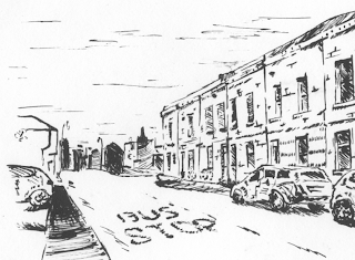
- The street and house that I have lived in for my final year at university.
I decided to go along with the Mr Gauky style of detailed, yet simple black outlines as it will enhance the Nikahrat's oddness, therefore showing she shouldn't really belong in this world.


A nice personal touch, I think, is the fact that the places depicted are from photographs of places that mean something to me.
Top to bottom:
- One of the buildings on the university FCH campus.
- The building I always walk by every day as I go into town and university.
- One of the back streets in Angouleme, France, where I spent three days at the BD festival. It was a huge turnaround point for me in my professional career.- The street and house that I have lived in for my final year at university.
Subscribe to:
Posts (Atom)