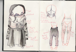
Now that I have a better understanding of how my book should look when it is complete, I want to start reviewing certain aspects.
The first of these is Nikahrat herself.
One sad thing I noticed when comparing the first sketches to the depictions in my dummy book was that she had become too simple.
The body had dramatically changed and so had the face. Therefore, I want to try and revert back to some of my original ideas, while adding in some new ones too.
 |
| First page in design sketchbook. |
Because the Nikahrat is supposed to blend into the background to show how humans don't acknowledge her existance, I began to think of some contrasting applications that could be used to emphasise her presence.
- The apparent softness of her skin / Rough textures around her
- Currently naked state / Heaps of material in the form of clothing
- Soft curves and lines / Angular, rough, uneven cuts in the clothing
- Light coloured skin / Dark or contrasting clothing
For the clothing inspiration, I took ideas from my own fashion preferences. The current revival of grunge, punk and gothic clothing has seen an advance in a style that I would call 'Post-Apocolypitc'.
The idea of this style is
- Black/dark coulours
- Angular/ irregular cuts, hems, folds and levels
- Layers
- Snoods,cowels, hoods
- Lots of material in certain layers
- Contrasting legs (legs tapered, made to appear thinner)
 |
| Quick initail designs. |
 |
| Further found inspiration. Concentrating on decoration and headpieces. |
While working on this, I had a change in heart over the body shape.
Taking mental references from old civilisations and Hitler's ideaology of women, I began to look at the shaps of Nikahrat's hips.
Wider hips in most old cultures were seen as being more desirable in women, as this was a sign of better child bearing and fertility.
This can link to Nikahrat's poor situation of having to carry such a large, hateful and difficult child. It also shows that she does have the air of fragile, stereotypical femininity about her with the big hips and small waist.
This lead me into looking at the clothes differently...
 |
| Page for looking at contrast between clothing and bare skin. |
 |
| Body shape template (with 'baby bump' and pregnancy waistline). |
 |
| Skirt and chaps alternative. |
 |
| Shorts alterenative. |
I played around with how I could reveal skin. I didn't want to draw arms and necks too much because the shape of the clothes is supposed to distort the view of her anatomy underneath, almost to alien-like standards. I wanted to show the legs off, because the clothes would bring all the attention up to the face and also because she is tall compared to a human. The thought of her pale skin and bare legs suggests that humans would only really see her shins or lower at eye level so they wouldn't really see her standing in front of them.
From this first body template, I photocopied more to use as models for silhouette designs.
I concentrated on the silhouette first as this is what is going to give Nikahrat more character and emotion, epecially at tense moments in the narrative.
 |
| Four sillouette alternatives. |
This idea did seem to be going well.
However, I decided to put these new designs to other individuals to see what impression they got from the new Nikahrat.
The conclusion was, from most, that it was possibly too pretty, stylish and sexual.
After a short time away from this I looked back and agreed.
Though it was a very interesting avenue to explore, I was losing the Nikahrat's origins and purpose more than emphasising them.
I decided that this was a good time to leave this idea behind, taking what I learnt, and revert back to the very origins of the first design....

